Dashboards offer quick access to organization-wide and population-level monitoring and reporting features. Use dashboards to drill down into the performance of individual organization facets, or track and compare performance across different facets, with visual overviews and clinical summaries to help highlight clinical and organizational outliers.
When first logging in to the Parable web app, the Clinical Dashboard appears as the default view. Select a different Dashboard view by clicking "Dashboard" on the left-hand navigation bar of the Parable.
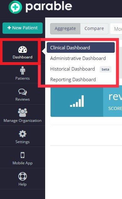
Clinical Dashboard
The default Clinical Dashboard view features a view toggle and region select drop-down menu on the top-left corner. The default region view for the Clinical Dashboard can be changed under personal settings.
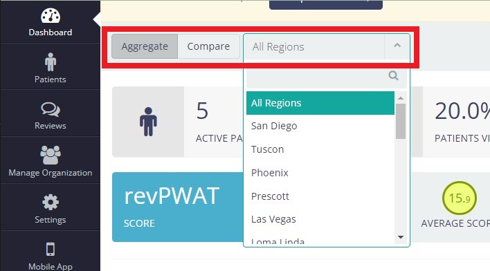
Aggregate View
Aggregate view provides an at-a-glance overview of the selected region.
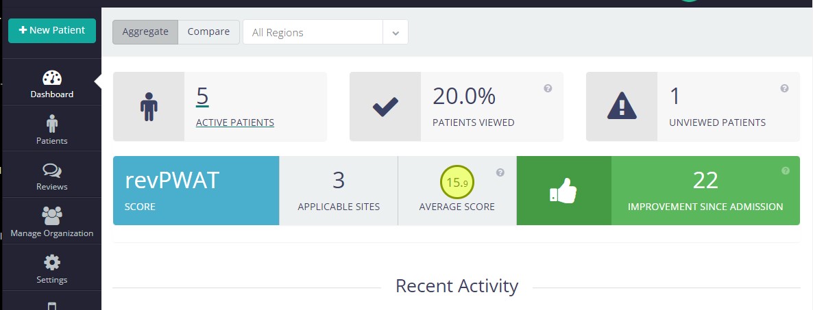
Active Patients
This box shows the number of patients with active cases and can be clicked to bring up the Patient List.
Patients Viewed %
A patient is considered viewed whenever at least one clinician from your organization has viewed all of the most recent updates for a patient's wound/lesion sites.
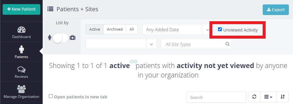
Unviewed Patients
A patient is considered unviewed whenever there are updates (check-ins/assessments, photos, messages) that nobody from your organization has viewed. This box can be clicked to bring up the Patient List with the 'Unviewed Activity' filter already selected.
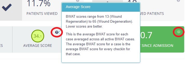
Protocol Summary
For organizations using specific protocols, rows at the bottom of the Aggregate View screen provide summary information such as # of applicable wound/lesion sites, average scores, and aggregate improvement/decline percentages.


Click on the "?" icon bubbles to bring up information about the scores listed.
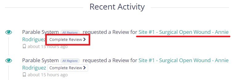
Recent Activity
At the bottom of the screen, all recent actions by organization members are displayed with clickable links to navigate to relevant sections or complete reviews.
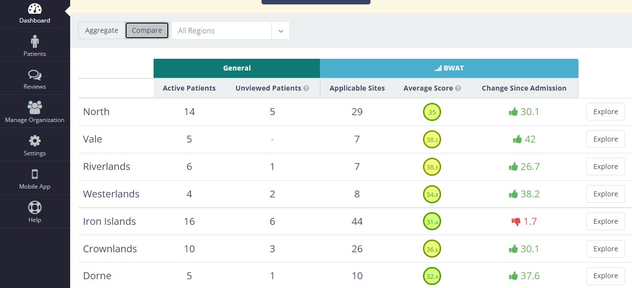
Compare View
By toggling the Compare button, users can see a breakdown of performance by facet (e.g. region, team, facility, zip code, etc). This can help with better resource allocation, identifying outlier cases, etc.
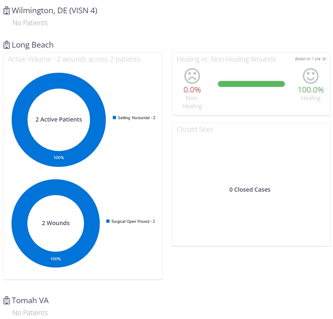
Administrative Dashboard
This Administrative Dashboard offers a high-level performance overview from an administrative perspective. This dashboard displays a visualization around patient volume by facet, breakdown by wound/lesion type, % of healing vs non-healing wounds, as well as any customizations that have been created for your organization.
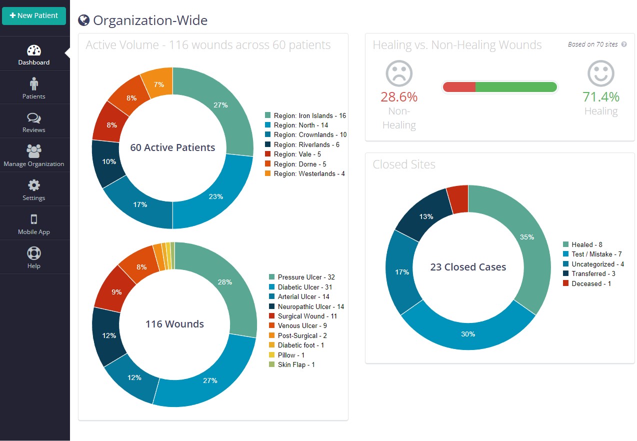
An organization-wide chart is displayed at the top of the page. Scroll down to view breakdowns for individual regions.
Historical Dashboard [Beta]
Beta Feature. This feature is still under development. Please direct any questions or comments to support@parablehealth.com
The Historical Dashboard displays timeline graphs of organization activity, allowing for quick visual overviews and comparisons of performance across regions. Use the filters on the left side of the screen to select between facets or adjust the date range.
Reporting Dashboard
Use this dashboard to access and export a variety of reports in Excel/CSV format.
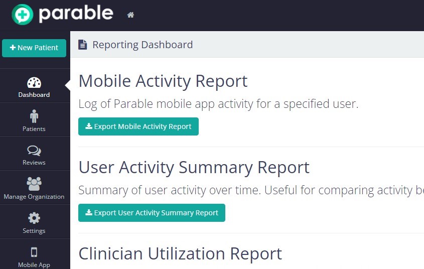
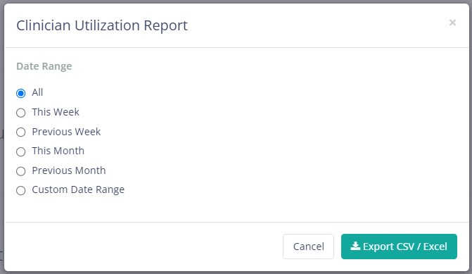
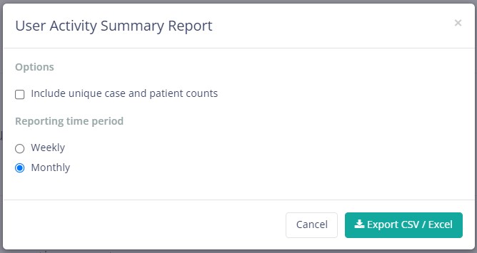
Clicking on the export button will prompt you to select parameters based on the type of report being exported.
The following report types types are available:
- Mobile Activity Report
- User Activity Summary Report
- Clinician Utilization Report
- Facet Utilization Report
- Patient Throughput Report
- Check-ins Report
- Patients with no ADT Messages Report